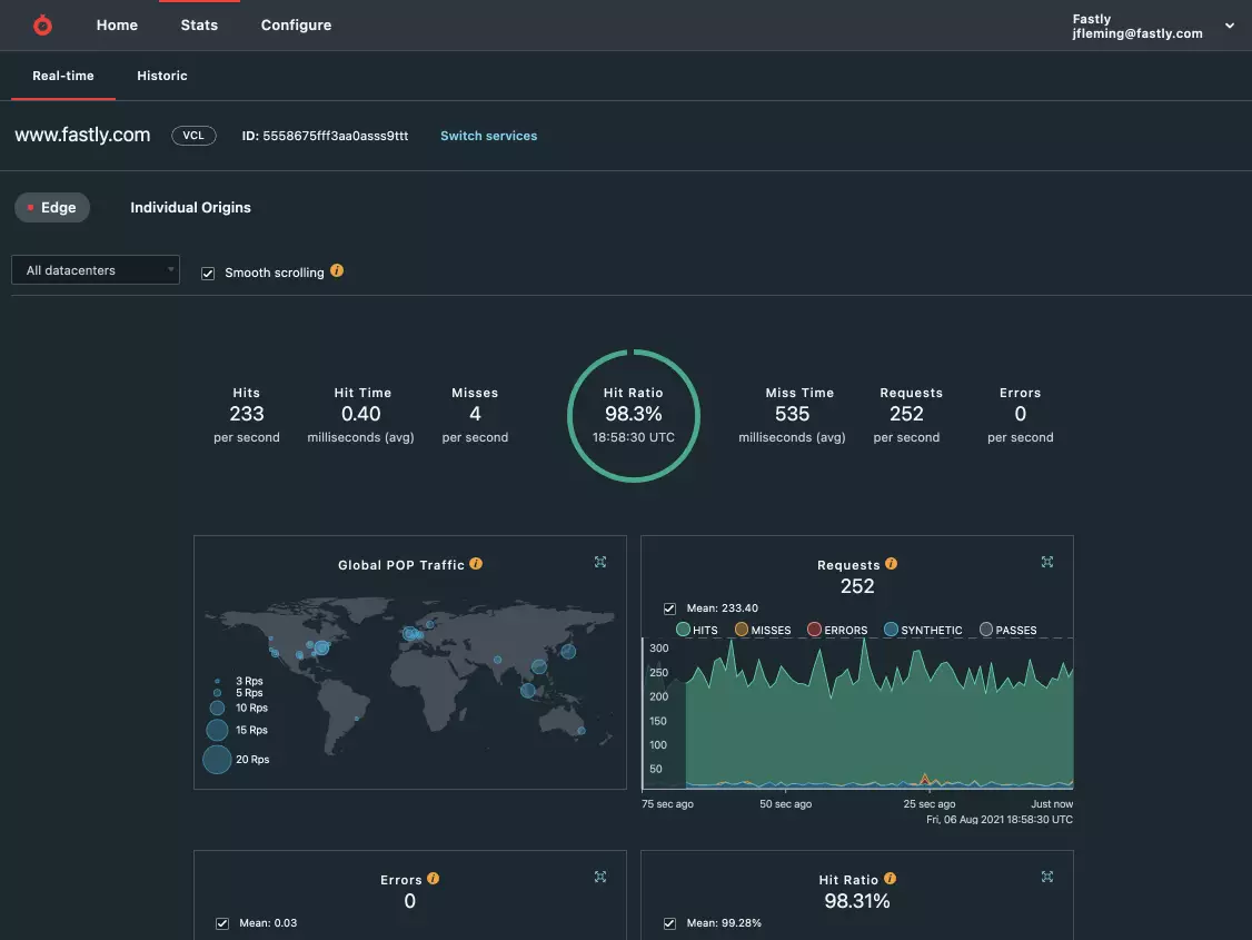
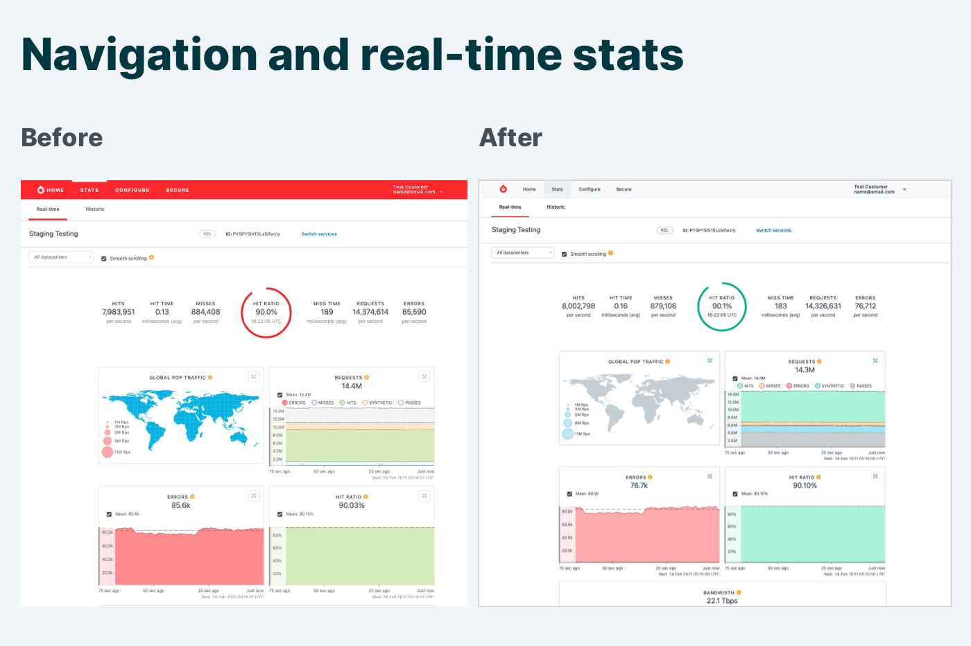
Improving ease of use and the overall user experience of the Fastly control panel is an ongoing effort for the product design team, and we take our customers’ opinions into account. Over the past few months, we’ve rolled out a series of design improvements focused on text readability, easing eye-strain, and providing a seamless brand experience.
In making these changes, we considered customer feedback about the use of red, on-screen legibility, and alignment with our brand style. We also worked closely with our brand design partners in marketing to create a more consistent experience for our customers with a common design language. Read more…

Related Posts

8 ways to improve user experience for web applications
A modern web application user wants to complete tasks with minimal fuss and…


Product design at Fastly: creating useful enterprise experiences
If design follows the same fundamental process, why would this methodology be…

Introducing dark mode: reduce eye strain in the Fastly UI
Reduce eye fatigue in low-light conditions or at night. Dark mode also…